
Excel can display several types of graphs to visualize data. There are at least 26 different graph types in Excel.
Contents
Excel Graphs
The following table shows the most common graphs in Excel.
| Graph | Description |
|---|---|
| Area | trends over time or by category |
| Bubble | three values, the third value graphed as the size of a bubble |
| Column | vertical display |
| Bar | horizontal display |
| Combo | combines two or more chart types |
| Line | trends over time or by category |
| Pie | components of a total amount |
| Stock | stock prices and volume trends over time |
| X Y (Scatter) | compares pairs of numeric values on the x and y axes |
Note: Avoid 3-D graphs and unusual text and color combinations.
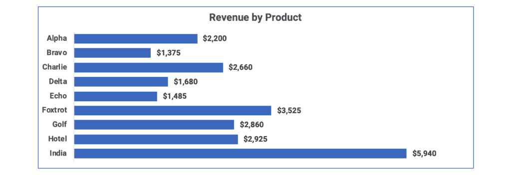
Bar Chart
A bar chart shows categorical data in horizontal bars. The first bar chart shows the data alphabetized by product name.
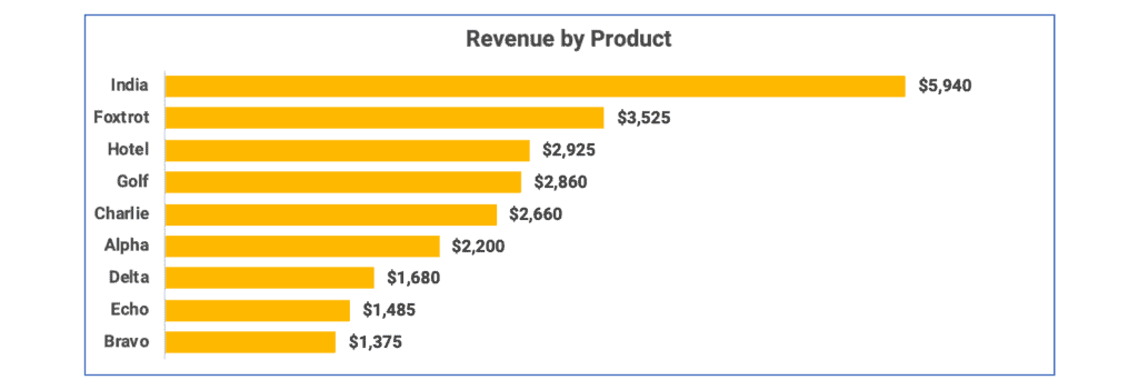
The second bar chart shows the data sorted in descending order by product revenue.
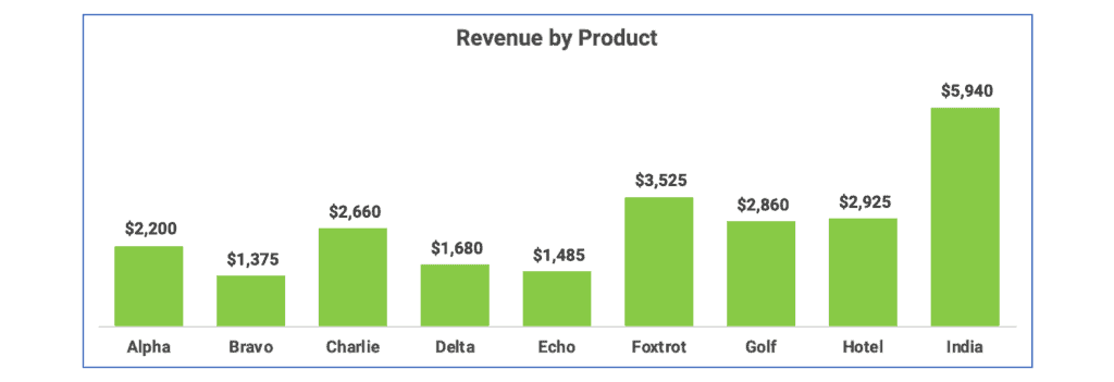
Column Chart
A column chart puts categorical data into vertical columns. The first column chart is sorted by name.
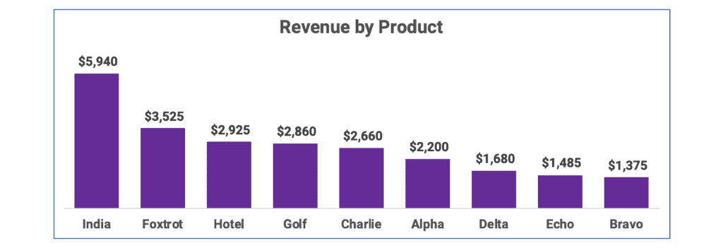
The second column chart is sorted by revenue from the largest to the smallest.
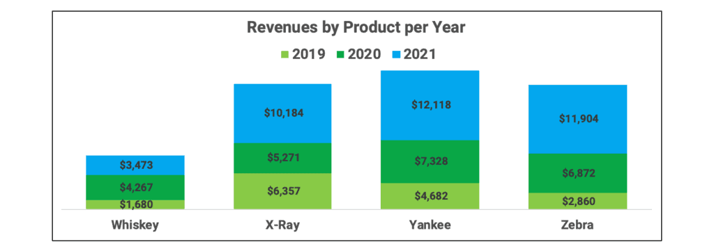
Stacked Column Chart
A stacked column chart shows data series stacked in vertical columns. The first stacked column chart is sorted by name.
The second stacked column is sorted by revenue for 2021.

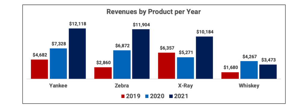
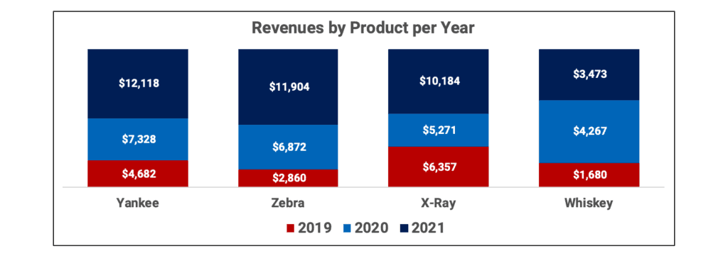
Clustered Column Chart
A clustered column chart groups data series clustered in vertical columns. For each product, the graph shows all three years of revenue. The first graph sorts by product name.
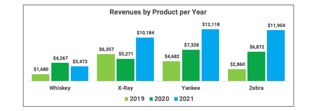
The second clustered column chart sorts the groups by 2021 revenue.
100% Stacked Column Chart
A 100% stacked column chart shows all the stacks the same size. The stacks show relative data in stacked columns equal to 100%. So, a column that totals 5,000 is the same size as a column totaling 10,000. It shows the relative size of the column components.
A 100% stacked column chart could be used in place of a pie chart. The first 100% stacked column graph is sorted by product name.
100% Stacked Bar Chart
A 100% stacked bar chart shows all the bars the same size. The bars show relative data in rows equal to 100%. So, a bar that totals 12,000 is the same size as a bar totaling 20,000. It shows the relative size of the bar components.
A 100% stacked bar chart could be used in place of a pie chart. The first 100% stacked bar graph is sorted by product name.


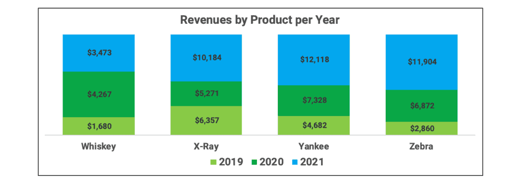
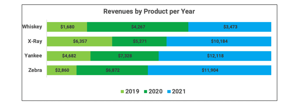
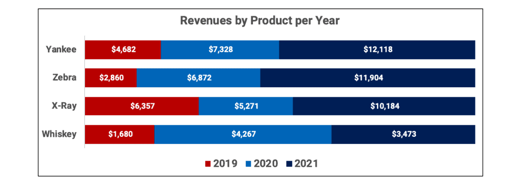
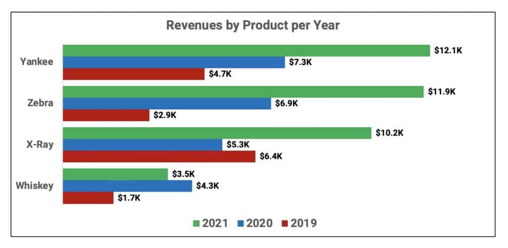
Stacked Bar Chart
A stacked bar chart shows several data series on the same bar. The stacked bar shows the relative size of the data. It is the horizontal equivalent of a stacked column chart. A bar of 30,000 would be twice the size of a bar of 15,000.
The following chart shows revenue by product per year sorted alphabetically by product name.
The following chart shows revenue by product per year sorted by 2021 revenue.
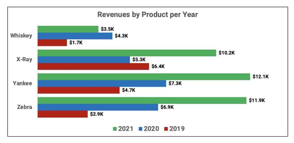
Clustered Bar Chart
A clustered bar chart has data series clustered in horizontal bars.
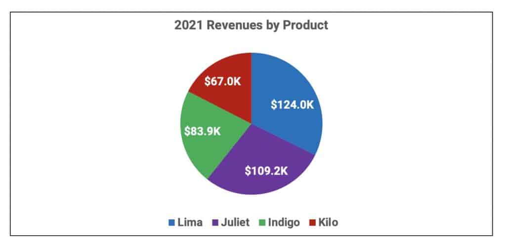
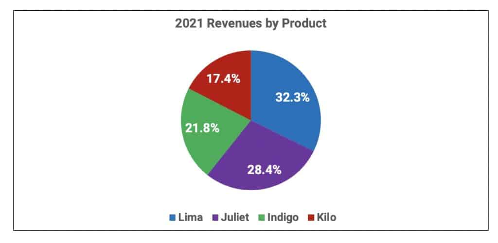
Pie Chart
A pie chart expresses a component relationship. All the pieces together represent 100%.
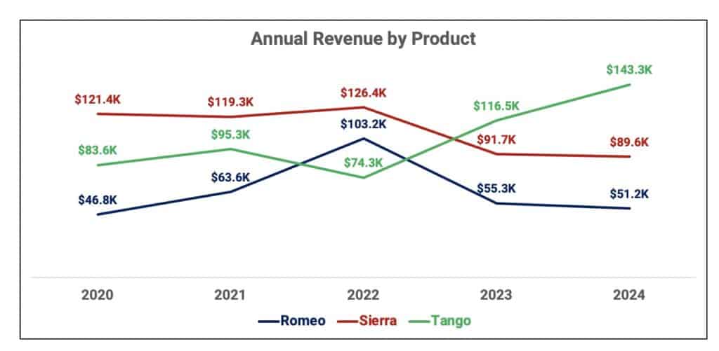
Line Chart
A line chart shows several data series plotted as separate lines. This displays trends over time.
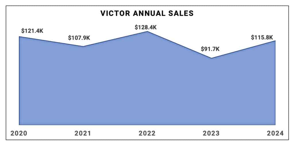
Area Chart
An area chart shows one data series plotted as a line filled in below. It is similar to a line chart with one line. An area chart shows trends over time.
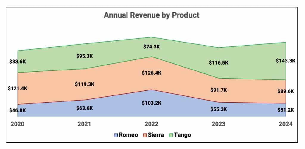
Stacked Area Chart
A stacked area chart shows data series plotted with filled areas stacked, one on top of the other.
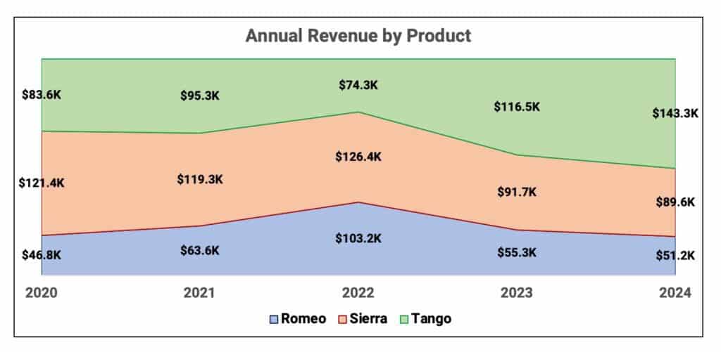
100% Stacked Area Chart
The 100% stacked area chart shows data plotted as areas and stacked so that the cumulative area always represents 100%. It shows the composition and progression of the data series.
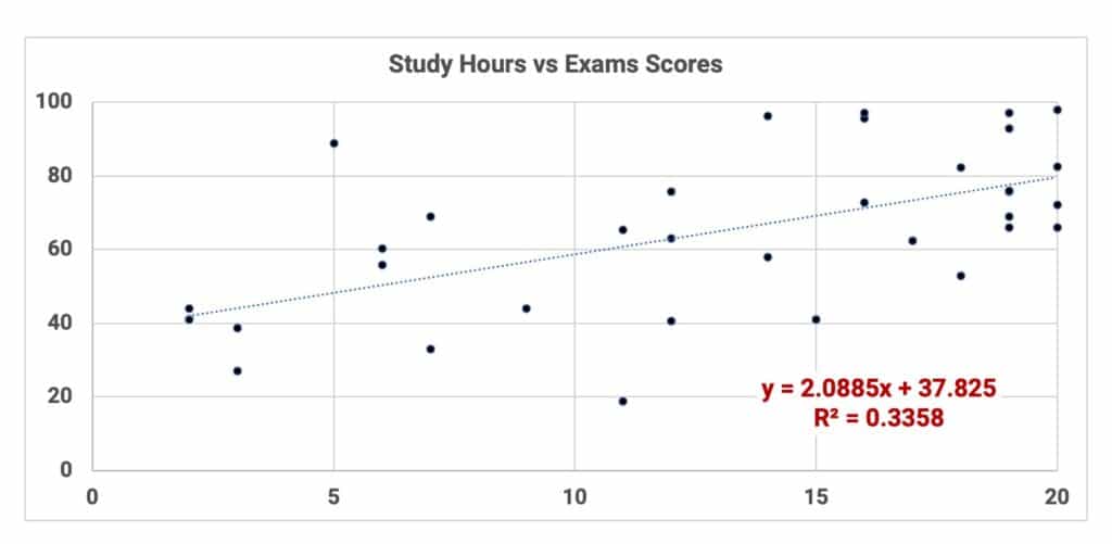
XY Scatter Plot
XY chart that shows the relationship between two variables. X is the independent variable on the horizontal axis. Y is the dependent variable on the vertical axis.
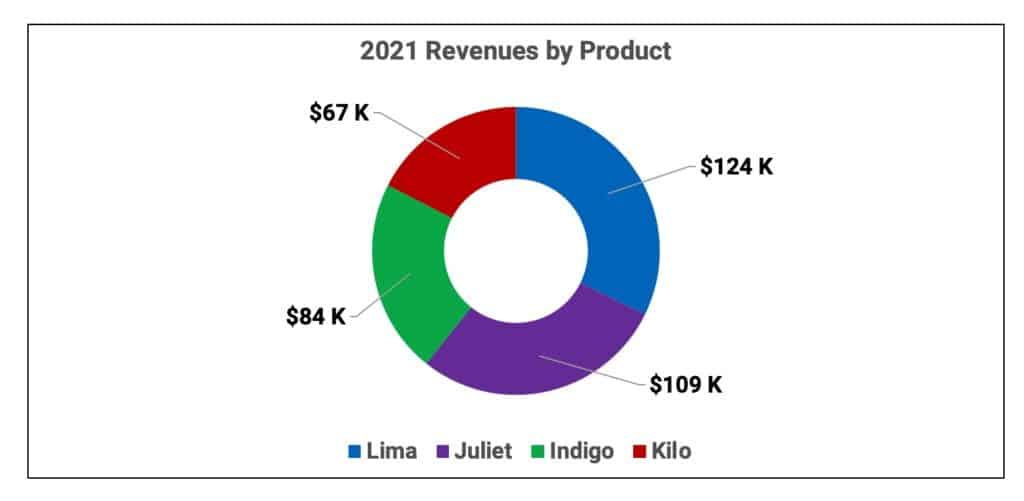
Doughnut Chart
A doughnut chart is a modified pie chart that expresses a component/total relationship. All pieces together represent 100%.

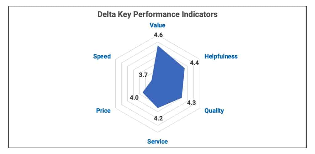
Radar Chart
A radar chart sometimes called a spider chart, has one axis per category which all use the same scale. The axes of a radar chart radiate out from the center of the chart and data points are plotted on each axis using a common scale.
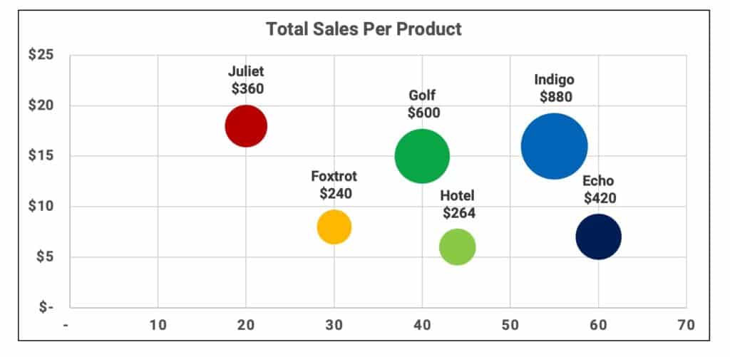
Bubble Chart
Bubble charts are a special kind of XY chart that can display a third data series. The third series is used to scale the bubble plotted at X and Y values. You can think of a bubble chart as “X versus Y, scaled by Z”.
The XY data shows the location on the chart. The Z data shows the size of the bubble. Bigger Z values show bigger bubbles.
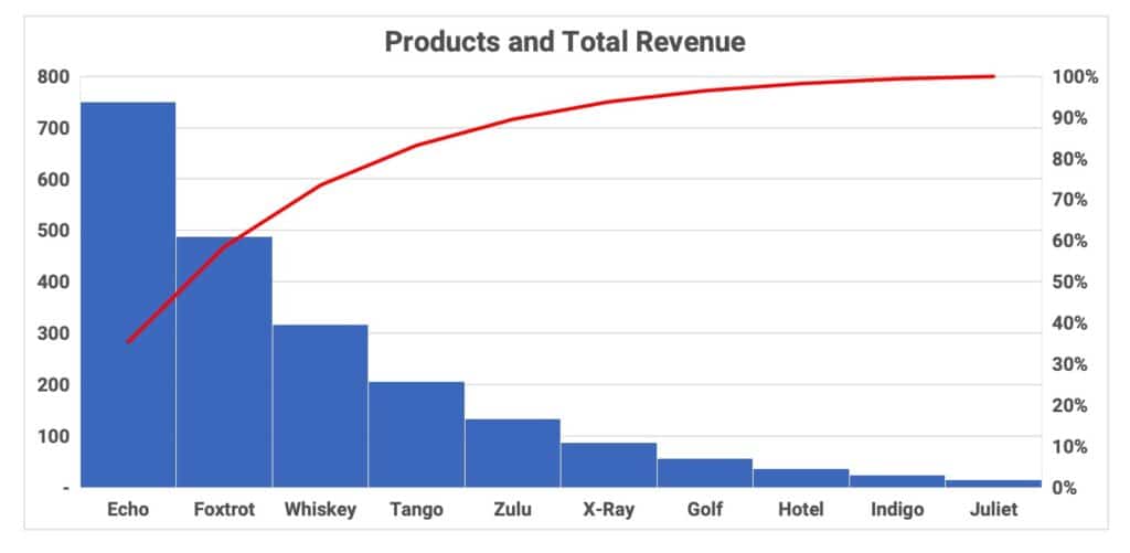
Pareto Chart
A Pareto chart is a combo chart using a histogram in descending order and a line chart showing the contribution to 100%. Pareto analysis is also called the 80/20 rule. In many data sets, roughly 20% of the categories account for 80% of the data.
Pareto analysis usually involves ideas like the following:
- 80% of the results is achieved by 20% of the work
- 20% of customers provide 80% of the revenue
- 80% of problems is from 20% of the causes
Pareto analysis is not a specific rule but a generalization that many results come from few inputs. This helps managers focus on the actions with the highest benefit.
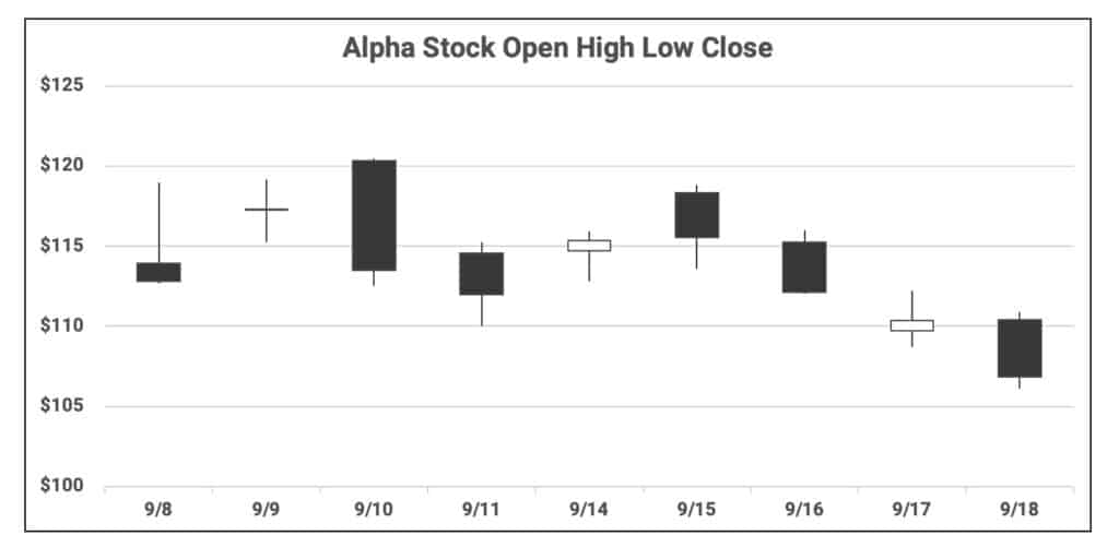
Candlestick Chart
A candlestick chart is used to show stock price activity. It plots Open-High-Low-Close (OHLC) stock prices.
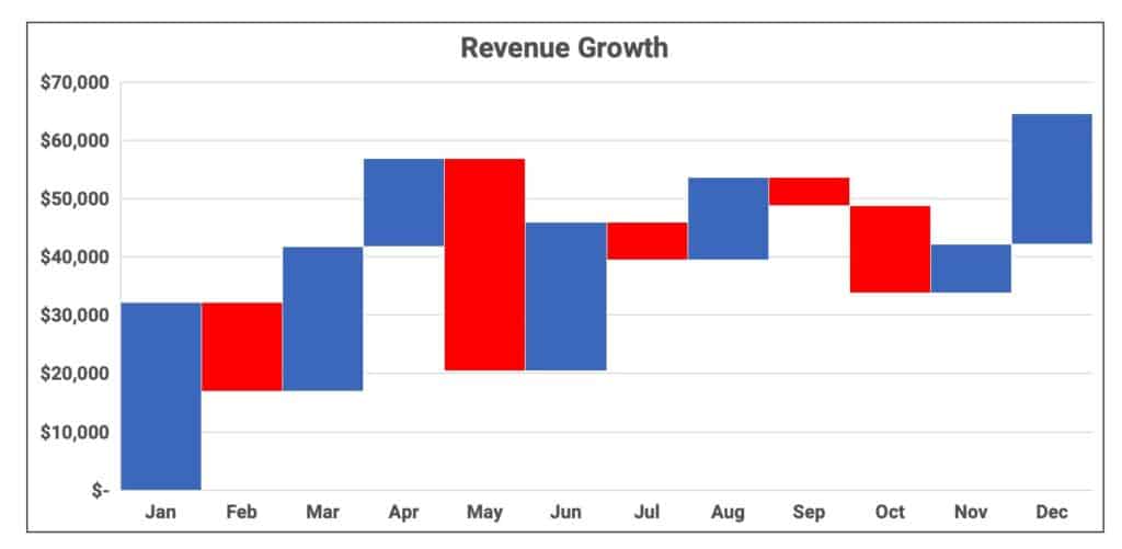
Waterfall Chart
A waterfall chart is used to plot the cumulative result of values as a visual running total. Positive values extend upward and negative values extend downward. It shows how an initial value is affected by subsequent positive and negative changes.
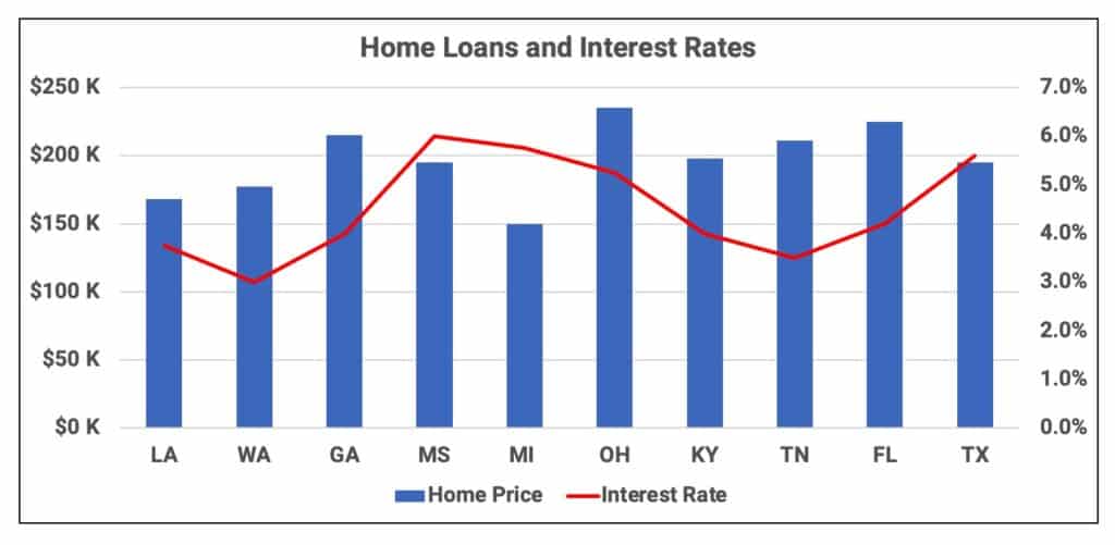
Combo Chart
A combo chart is a hybrid of two more chart types. For example, the following graph is a column chart plus a line chart.
Video: Infographics in Excel
Video: Creating Graphs in Excel
Excel Basics Lessons for Beginners
Here are the Excel basics lessons for beginners in The Ultimate Guide to Finally Learn Excel.
- Introduction to Excel
- Statistical Analysis in Excel
- Creating Graphs in Excel
- Logical Functions in Excel
- Text Functions in Excel
- Financial Functions in Excel
- Lookup Functions in Excel
- Data Analysis in Excel
- What-if Analysis in Excel
See Also: